
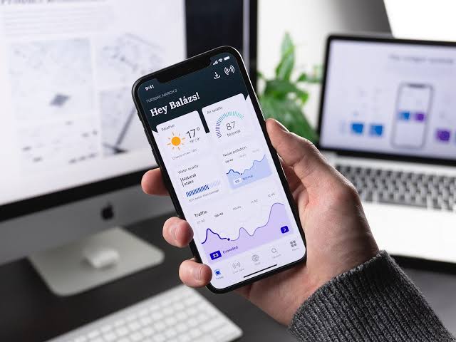
Mobile-First Web Design in 2026 & 2027: Why Your Business Website Must Work on Phones
The way people browse the internet has changed dramatically. Smartphones have become the primary way millions of people discover businesses, research products, compare services and make purchasing decisions. As we move through 2026 and towards 2027, having a website that works perfectly on mobile devices is no longer optional. It is essential.
For businesses, a poorly designed mobile website can mean lost enquiries, frustrated visitors and missed sales opportunities. A professional mobile-first website, on the other hand, makes it easier for potential customers to find information, navigate services and contact your business.
Whether you operate a small local business, an established company or an international brand, your website needs to deliver an excellent experience across smartphones, tablets and desktop computers.
What Is Mobile-First Web Design?
Mobile-first web design is an approach to website development that prioritises the smartphone experience before expanding the design to larger screens.
Rather than designing a traditional desktop website and attempting to squeeze it onto a smaller screen, mobile-first development starts with the limitations and requirements of mobile devices.
This means considering:
- Easy-to-use navigation and menus.
- Readable typography without unnecessary zooming.
- Fast-loading pages and optimised images.
- Clearly positioned contact and enquiry buttons.
- Simple layouts that make important information easy to find.
- Touch-friendly buttons and interactive elements.
- A consistent experience across different screen sizes.
A properly developed responsive website automatically adjusts its layout to suit the visitor’s device, helping ensure that content remains accessible and easy to use.
Why Mobile-Friendly Websites Matter in 2026
Mobile browsing continues to play a central role in how customers interact with businesses online. People increasingly expect to access information immediately, whether they are searching for a local service, booking an appointment or purchasing a product.
If your website is difficult to use on a smartphone, visitors may simply leave and choose a competitor.
A mobile-friendly website helps businesses:
Generate more enquiries: Visitors should be able to find your contact details, telephone number and enquiry forms without struggling to navigate the website.
Improve customer experience: Clear layouts, readable content and intuitive navigation make it easier for customers to understand what your business offers.
Build credibility: A modern, professionally designed website creates a positive first impression and helps establish trust.
Increase conversions: A well-structured mobile experience removes unnecessary obstacles between discovering your business and becoming a customer.
Support search engine visibility: Google primarily uses the mobile version of website content for indexing and ranking.
Responsive WordPress Website Design
WordPress remains one of the most flexible platforms for developing professional business websites. When developed correctly, WordPress can deliver responsive websites that work across smartphones, tablets, laptops and desktop computers.
Responsive WordPress web design involves more than simply selecting a mobile-friendly theme. The entire website needs to be considered, including its page layouts, typography, navigation, images, plugins and interactive features.
A professionally developed WordPress website should provide:
- Flexible layouts that adapt to different screen sizes.
- Mobile-friendly navigation and menus.
- Properly scaled images and video.
- Optimised page loading performance.
- Accessible forms and interactive features.
- Consistent branding across devices.
- Search-engine-friendly page structures.
For businesses using WooCommerce, mobile optimisation is particularly important. Product pages, shopping carts, checkout processes and payment options must all work smoothly on smaller screens.
Mobile SEO and Google’s Search Rankings
Mobile optimisation is also an important part of modern search engine optimisation.
Google uses mobile-first indexing, meaning it primarily uses the mobile version of a website’s content for indexing. If important content is missing or inaccessible on mobile, it can potentially affect how search engines understand your website.
A strong mobile SEO strategy should include:
Consistent content: Ensure important information, headings, internal links and structured data are available on mobile and desktop versions.
Responsive layouts: Use a website structure that adapts naturally to different devices.
Fast loading speeds: Reduce unnecessary scripts, optimise images and minimise resources that slow down the mobile experience.
Readable content: Use appropriate font sizes, spacing and heading structures.
Technical optimisation: Ensure search engines can access and crawl important website resources.
Mobile SEO should not be treated as a separate activity from website development. It should be considered from the beginning of every professional website project.
Website Speed and Core Web Vitals
Website speed is one of the most important considerations when developing a modern mobile website.
Visitors expect pages to load quickly, particularly when browsing using mobile networks. A slow website can create frustration and discourage potential customers from exploring your services.
Google’s Core Web Vitals provide useful measurements of website user experience.
The three main metrics are:
- Largest Contentful Paint (LCP): Measures how quickly the main page content loads. The recommended good result is 2.5 seconds or less.
- Interaction to Next Paint (INP): Measures how quickly a website responds to user interactions. The recommended good result is 200 milliseconds or less.
- Cumulative Layout Shift (CLS): Measures unexpected movement of page elements while loading. The recommended good result is 0.1 or less.
Improving these measurements involves optimising images, reducing unnecessary JavaScript, using efficient hosting, implementing caching and reviewing the performance of WordPress plugins.
A fast website does more than improve technical performance. It helps create a smoother experience for potential customers.
Mobile Web Design Trends to Watch in 2027
As website technology continues to develop, mobile web design is becoming increasingly focused on usability, performance and personalisation.
Several developments are worth considering when planning a new website for 2027.
1. Simpler and Cleaner Website Layouts
Minimalist layouts help visitors focus on important information without unnecessary distractions. Clear headings, effective spacing and well-organised content can make websites easier to navigate.
2. AI-Powered Website Experiences
Artificial intelligence is creating new opportunities for businesses to improve their websites. AI-powered chat assistants, automated customer enquiries and personalised content experiences can help visitors find information more efficiently.
3. Faster and More Efficient Websites
Performance will remain a priority. Modern image formats, efficient code, improved hosting and better content delivery will continue to play an important role in mobile website development.
4. Improved Mobile Navigation
Navigation should be intuitive, with clearly labelled menus, accessible buttons and simple pathways to important pages.
5. Better Mobile Shopping Experiences
For WooCommerce websites, streamlined checkout processes, simplified product pages and easy payment options will remain important for converting mobile visitors into customers.
Common Mobile Website Design Mistakes
Even established businesses can have websites that perform poorly on smartphones.
Some of the most common problems include:
- Text that is too small to read comfortably.
- Menus that are difficult to open or navigate.
- Buttons positioned too close together.
- Images that take too long to load.
- Pop-ups that cover important content.
- Contact forms that are difficult to complete.
- Desktop layouts that have not been properly adapted for mobile.
- Excessive animations and unnecessary visual effects.
These problems can negatively affect the visitor experience and potentially cost businesses valuable enquiries.
Regular mobile testing is essential, particularly after making significant website updates or installing new WordPress plugins.
What Should Every Business Website Include in 2027?
A modern business website should be designed around the needs of its customers while providing a reliable technical foundation.
At a minimum, businesses should consider:
- A fully responsive mobile-first website design.
- Professional branding and consistent visual presentation.
- Clear service descriptions and business information.
- Prominent telephone and enquiry options.
- Search-engine-friendly content and page structures.
- Fast loading performance and secure HTTPS connections.
- Easy-to-use navigation across all devices.
- Regular WordPress updates, backups and security monitoring.
- Analytics and performance monitoring.
- A flexible website structure that can grow with the business.
Your website is often the first interaction a potential customer has with your company. Investing in professional development can help ensure that this first impression is a positive one.
Why Choose Professional WordPress Web Design?
Building a website that looks attractive on a desktop computer is only part of the process. Professional website development requires an understanding of responsive design, technical SEO, performance optimisation, accessibility and the practical needs of businesses.
An experienced WordPress web designer can help create a website that not only looks professional but also works effectively across modern devices.
From initial design and development to WooCommerce integration, SEO optimisation and ongoing website maintenance, every element should contribute towards a reliable and effective online presence.
Final Thoughts: Preparing Your Website for 2027
Mobile-first web design is no longer a future trend. It is an essential part of building a successful online business in 2026 and beyond.
Customers expect websites to load quickly, look professional and provide a straightforward browsing experience regardless of the device they are using.
If your existing website has not been reviewed or updated for mobile users recently, now is an excellent time to assess its performance, usability and search engine visibility.
A professionally designed, responsive WordPress website can help your business remain competitive, improve customer experiences and generate more opportunities online.
Looking for professional WordPress web design? Invest in a modern, mobile-friendly website that is built around your business and your customers.
